Anonymous

Your Opininions

The all purpose forum for any TR7/8 related topics.
RJS
Swagester
Posts: 616
Joined: 04 Apr 2007 00:03
Location: USA
Contact:

Your Opininions

Postby RJS » 10 Oct 2011 00:39

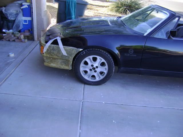
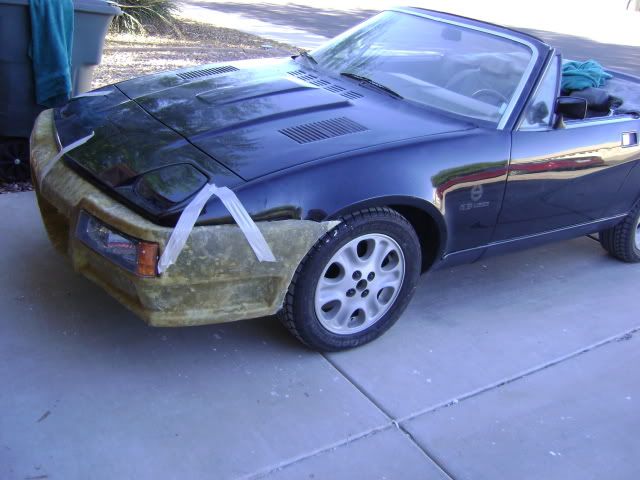
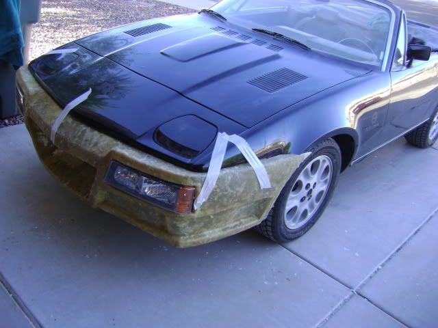
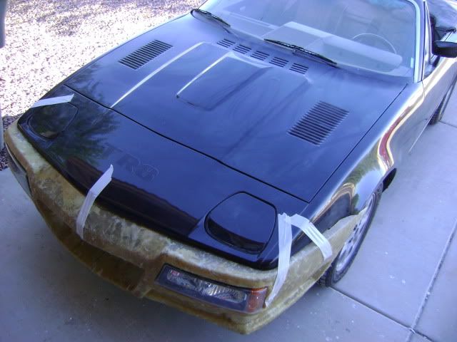
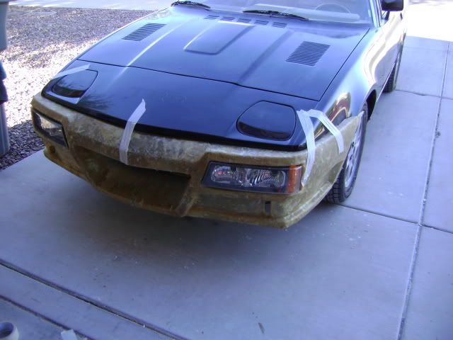
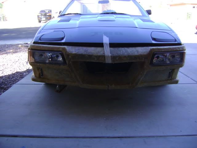
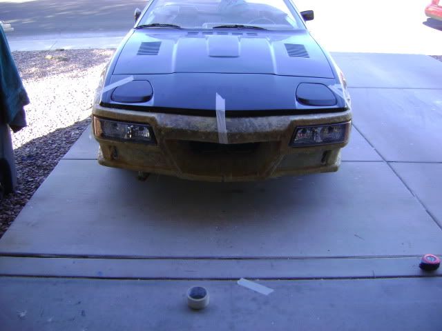
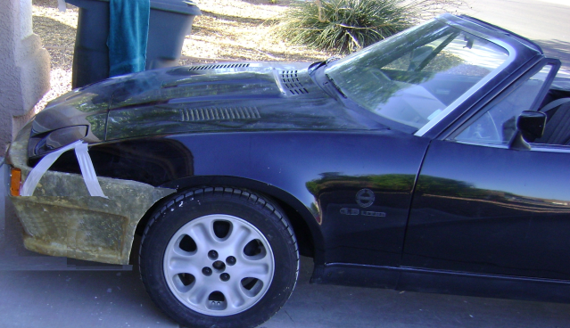
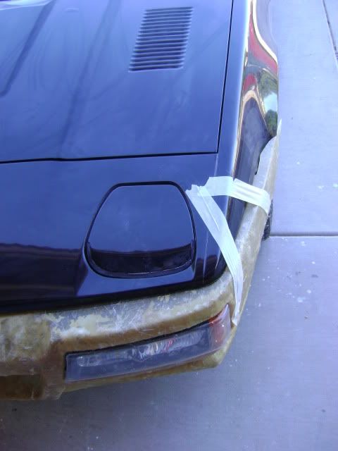
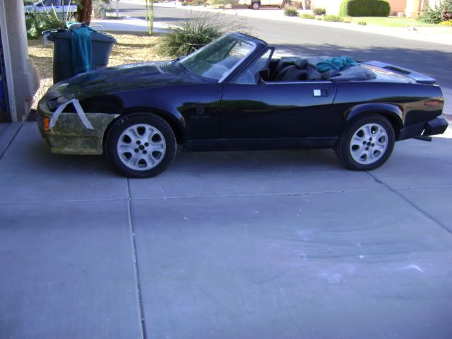
I have never liked the rubber bumpers on our wedges so I have been experimenting with a different front end.

So far I have on invested a lot of time and few dollars on this. Trying to decide if I like it enough to finish it off and put on my car.

It is just rough fiberglass so far, so don't critique on the finish (of lack of).

Sometimes I like it, and sometimes I think it is not worth finishing. Right now I am thinking it is not as good as the stock front end.

What do you think?

Image
Image
Image
Image
Image
Image
Image
Image
Image

Rob

trekcarbonboy
Swagester
Posts: 940
Joined: 18 Oct 2010 15:38
Location: USA

Postby trekcarbonboy » 10 Oct 2011 01:12

Not a bad effort. I like to see a little inginuity. If thats totally hand fabbed nice work.

That being said I personally don't like the lights (way to big) or the big wide fish mouth. Also looks a bit bulky for the car.
Thats just my opinion. The most important thing is if you like it then go for it.

How about just fiberglassing the metal bumper insert and adding a rally spoiler. Iv'e always thought the bumper was just too bulky and projected out too far. By removing the rubber cover and glassing the insert you loose about 1.5 inches off the front and keep the basic original shape. I think you should do that since you clearly have the skills, and then make me one too![:D][:D]

Craig '75 2.0 FHC
Image

niichan gt-r
Wedgling
Posts: 33
Joined: 28 Sep 2011 07:32
Location:
Contact:

Postby niichan gt-r » 10 Oct 2011 01:23

...Definitely don't go sawing pieces of it off on my accord, as quality-wise it looks pro, pretty awesome already, even to me, and I prefer cars stock typically [:0]

It looks best from frontal aspect, definitely, very menacing. The only trouble I have with it is the trouble I have with most aftermarket bumper kits, it's much more boxy than the more "fuselage" tucked-type tr7 body sides. But maybe that's a styling trope I tend to miss out on.

I definitely think it's worth finishing, with or without any changes, but if you were to make any, I'd smooth out the ends so that they tapered in further down rather than flared out with the lip on the lower sides, more matching the sides of the car. Anyone please speak up to disagree.

Great job overall, it looks like a pro job and will look great with paint, and I wish I could do things like that [8D]

FI Spyder
TRemendous
Posts: 8917
Joined: 03 Jul 2006 19:54
Location: Canada

Postby FI Spyder » 10 Oct 2011 01:47

Looks too bulky compared to the light airy design of the rest of car. The "fish mouth" is in keeping with current design philosophy of many of todays cars (which is why I wouldn't buy one of them). You could call it "The Guppy".[:D]


- - - - TR7 Spider - - - - - - - - 1978 Spitfire - - - - - - 1976 Spitfire - - 1988 Tercel 4X4 - Kali on Integra - 1991 Integra - - Yellow TCT
Image

rgsSpider
Wedge Pilot
Posts: 434
Joined: 30 Jul 2011 04:57
Location: USA
Contact:

Postby rgsSpider » 10 Oct 2011 02:52

I think you've done an awesome job, especially if you're calling this "rough"! I do second the motion on those lights, they are a little overpowering. Also, if you look at that last pic, the one that is straight on, what would you think of making the grill (mouth) opening more in line with the width of the larger hood bulge? My personal taste on the lights would be to have something a little sleeker, possibly LEDs. Great looking work though!

Randy

1980 TR7 <font color="red">Spider!</font id="red">
Image http://web.me.com/rg_spb/TR7_Spider/Home.html

RJS
Swagester
Posts: 616
Joined: 04 Apr 2007 00:03
Location: USA
Contact:

Postby RJS » 10 Oct 2011 03:15

When I first was drawing this up, I wanted to bring the bumper back to the fenders like the viper kit (my favorite TR7/8 front end). I also had always liked the fog lights / blinker in the bumper like the porsche 928 / 944 (turbo?), so I put those "in" the bumper.

I think what I am having problems with is how wide / tall the bumper part of this is. When I was shaping this, I took the bumper a few inches above and below the fog lights (I did it on purpose, but now think it was a mistake). I am thinking that if the bumper was the same height as the fog lights that it would look a lot better.

Does this "photoshop" look any better?
Image

To build this, I built a "frame" with scrap wood I had in my garage. I then attached foam to the frame, and shaped the foam with blade and sander. I then fine tuned the shape with wall joint compound. Then I went over it with layer of fiberglass. I then discarded the wood / foam plug and have this fiberglass shell left. Once / if I have a shape I like, I will build up the fiberglass from the inside out to add strength.
whitenviro
Swagester
Posts: 757
Joined: 20 Sep 2010 19:42
Location: Seattle, Washington

Postby whitenviro » 10 Oct 2011 17:43

It's a nice job, but looks a bit bulky. I like the guppy mouth and the lights! But the part under the lights and that hard bottom edge seem to give it a lot of bulk. Maybe those areas could taper back a bit more to keep with the wedge styling of the rest of the car?

Beans
TRemendous
Posts: 7795
Joined: 15 Mar 2006 19:29
Location: Netherlands
Contact:

Postby Beans » 10 Oct 2011 17:56

<blockquote id="quote"><font size="1" face="Century Gothic, Verdana, Arial, Helvetica" id="quote">quote:<hr height="1" noshade id="quote"><i>Originally posted by FI Spyder</i>
Looks too bulky ... <hr height="1" noshade id="quote"></font id="quote"></blockquote id="quote">
+1

<center>Image
<font color="blue"><i>1980 TR7 DHC (my first car, now restored and back on the road)
1981 TR7 FHC Sprint (better known as 't Kreng)</font id="blue">
<b>[url="http://www.tr7beans.blogspot.com/"]<u><b><font size="2"><font color="red">My Weblog</font id="red"></font id="size2"></b></u>[/url]</b></i></center>

davesopener
Wedge Pilot
Posts: 361
Joined: 19 Oct 2007 13:03
Location: United Kingdom
Contact:

Postby davesopener » 11 Oct 2011 10:10

hi,
I praise your inventiveness on this project
however I find it difficult to give an honest opinion
without seeing a painted and complete job.
look forward to seeing pictures of the finished job
Dave

tr8
Wedgista
Posts: 1172
Joined: 20 Apr 2004 16:20
Location: Canada
Contact:

Postby tr8 » 11 Oct 2011 14:43

I also think it is too bulky especially the very front middle where it projects forward. The sides seem heavy as well, but really difficult to see without being painted body color. Perhaps the headlights would be less prominent if they were smoked out like some do.

RJS
Swagester
Posts: 616
Joined: 04 Apr 2007 00:03
Location: USA
Contact:

Postby RJS » 11 Oct 2011 19:02

Thank you everyone for your comments.

This originally started out to be just a bumper to get rid of the rubber bumpers. It them morphed into what you see now.

I think I am going to trim it back to be basically just a bumper and get it finished and installed.

Down the road I might work on the front spoiler - air dam as separate project if I get aggressive on this again.

Rob

Bendder
Wedge Pilot
Posts: 352
Joined: 08 Jun 2005 16:33
Location: Canada
Contact:

Postby Bendder » 13 Oct 2011 01:44

boom!! the idea of making the bumper less deep like in your photo shopped version is much better.From the side it look much less over powering. I think maybe if you were to smooth out the hard lines of it it might match the softer more rounded edges of the front of the car more. I do like the way the front center section projects out a bit. Maybe having the bumper section go all the way across the front and having a sleeker wider opening be low the bumper. I have always liked the idea of two center mounted round lights maybe with two left and right grill openings would look neat also, but that would b totally different than what you are after I think. Great work though, I wish I had as much skill.


Mark
1977 TR7 FHC
1978 TR7 FHC
1980 TR7 DHC
1980 Rover SD1 4.0L

John Clancy
TRiffic
Posts: 1666
Joined: 07 Jan 2005 12:31
Location: United Kingdom
Contact:

Postby John Clancy » 13 Oct 2011 08:31

Try the UK spec bumpers which are not as massive as the US versions and look better than anything else.

But then I don't like those last of the line Grinnall things with the Volvo and Ford Orion lights so I'm unlikely to like any of these bulky fronts ends applied to any TR7 or 8.

<center><b>[url="http://www.triumphdvd.co.uk"]Triumph TR7 and other car documentaries on DVD here[/url]</b></center>

john
TRiffic
Posts: 1648
Joined: 22 Sep 2003 13:54
Location: United Kingdom
Contact:

Postby john » 13 Oct 2011 12:18

i Love it,it always facinates me how many different variations there are of the Tr7

And testament to its owners who have such an imaginations to continually improve and modify the car

Testamnet also to the car that with very minor tweeks it can be altered to suit the very latest trends

Hats off i say to Harris Mann for the original concept and striking shape

[8 whole cylinders worth of punch to ram the world through the windshield and out the rear view mirror. Car & Driver]
1981 Grinnall TR7 v8
1981 Black FHC
1979 & 1980 Black Premium FHC(laid to rest) Sorry :-(
Image

John

manny
Swagester
Posts: 741
Joined: 11 Sep 2010 15:52
Location: West Midlands UK

Postby manny » 13 Oct 2011 21:10

the head on view looks a bit like Mr Knight's transam...maybe....but very impressive...i suggest finishing it..but as other posts, the lights are bit overpowering, try a photoshop finish to get an idea

Kawasaki ZX636R
Piaggio fly 125

Post Reply

Who is online

Users browsing this forum: No registered users and 382 guests

cron